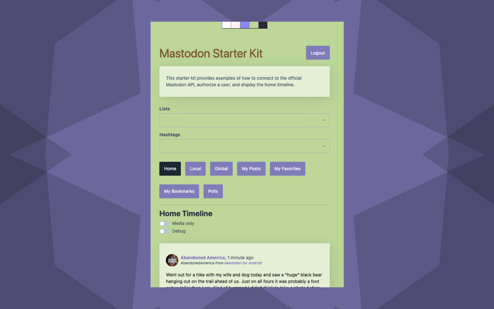
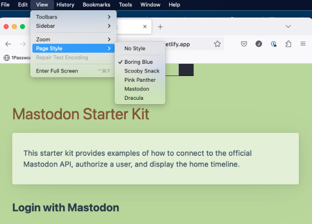
What’s a style switcher? Well, you know all about light and dark mode, right? Or, you might be more familiar with the term “theme” or “skin” - it’s all the same thing. A style switcher allows you to add themes or skins to your site. Style switchers are fairly common twenty years ago, as the magic of CSS was just starting to be explored. It allowed you to change the entire look and feel of a site without changing the content, providing all sorts of room for creativity in design.
Yes, children, we were excited about this back in the day. 👴🏻
With light and dark mode here to stay, and more apps (like Mona for Mastodon) adding the ability to switch between themes, I thought it would be fun to add a style switcher to my own site - and got a bit carried away.
There are all kinds of options for making this work - from complex react components to simple CSS-only solutions. I wanted to keep it simple, so I went with the CSS-only approach - with a LITTLE bit of javascript to make it work.
Let’s get to it.
The Setup
I use a wonderfully light CSS framework called PicoCss. It’s a great starting point for building a development site where you just want to get an idea out. It’s easy to customize, too, either with Sass or just by overriding the CSS variables.
The Theming Pattern
I chose to use the CSS variable pattern. All themes share a common stylesheet and a common set of CSS variables. Each theme has its own stylesheet that overrides the default variables.
1
2
3
4
5
6
7
8
9
10
11
12
13
14
15
16
17
18
19
20

/* Scooby Snack scheme  */
/* PicoCSS Overrides */

:root {
    --header-color: #7c5432;
    --primary: #7F7AB9;
    --primary-hover: #7F7AB9;
    --primary-focus: #7F7AB9;
    --background-color: #bcd797;
    --card-background-color: #E4EFD5;
    --card-sectionning-background-color: #A0D0CD;
    --code-kbd-background-color: #b9a28f;
    --code-kbd-color: #000000;
    --muted-border-color: #BBA18F;
    --accordion-border-color: #BBA18F;
    --accordion-open-summary-color: #000000;
    --accordion-close-summary-color: #000000;
    --progress-background-color: hsl(205deg, 18%, 86%);
    --progress-color: var(--primary);
}
Rinse and repeat for as many themes as you want!
Alternate Stylesheets
This is the crux of the solution. Alternative stylesheets are only fully compatible with Firefox, but they work well enough in other browsers to be useful. The idea is that you can define multiple stylesheets in your HTML, and then switch between them using javascript.
Here’s what it looks like in your HTML <head> section:
1
2
3
4

<link rel="stylesheet" href="/assets/css/style.css" title="default">
<link rel="stylesheet" href="/assets/css/style-boringblue.css" title="Boring Blue" disabled="true">
<link rel="stylesheet" href="/assets/css/style-mastodon.css" title="Mastodon" disabled="true">
<link rel="stylesheet" href="/assets/css/style-scoobysnack.css" title="Scooby Snack" disabled="true">
So here you have 3 alternate stylesheets, plus the default stylesheet. The title attribute is what will be used to identify the stylesheet in the javascript. Disabled is set to true for all but the default stylesheet, so that they don’t load by default.
Believe it or not - you COULD just stop here! If you were ok with this working only in Firefox…and if you were ok with the user having to go into the browser settings to switch themes. But we can do better.
The Switcher
The switcher is a simple <figure> element with a collection of buttons inside. Each button has an onClick (in this case, a Vue component, an @click attribute) that matches the title of the stylesheet. When the user clicks that option, the javascript will loop through the stylesheets and enable the one that matches the value of the selected option, disabling the rest.
1
2
3
4
5
6
7

    <figure id="theme_switcher">
      <button id="theme-toggle" @click="changeStyle('Boring Blue')" class="boringStyle"></button>
      <button id="theme-toggle" @click="changeStyle('Pink Panther')" class="pantherStyle"></button>
      <button id="theme-toggle" @click="changeStyle('Mastodon')" class="mastodonStyle"></button>
      <button id="theme-toggle" @click="changeStyle('Scooby Snack')" class="scoobyStyle"></button>
      <button id="theme-toggle" @click="changeStyle('Dracula')" class="draculaStyle"></button>
    </figure>
And the associated CSS to make it look nice:
1
2
3
4
5
6
7
8
9
10
11
12
13
14

#theme_switcher {
  display:flex;
  flex-direction: row;
  flex-wrap: nowrap;
  justify-content: center;
}

#theme_switcher button {
    border-right: none;
    border-top: none;
    border-bottom: solid 1px black;
    width:40px;
    height:30px;
}
The Javascript
Here’s the last bit. A javascript function that will do the work of enabling/disabling the stylesheets.
1
2
3
4
5
6
7
8
9
10
11
12
13
14
15
16

function changeStyle(styleName) {
    const links = document.head.getElementsByTagName('LINK');
    for (let i = 0; i < links.length; i++) {
            const link = links[i];

            if(!link.rel === "stylesheet" || !link.title) continue;

            if (link.title && link.title.indexOf(styleName) === -1) {
                link.disabled = true;

            } else {
                localStorage.setItem('theme', styleName);
                link.disabled = false;
            }
        }
}
The Missing Piece
At this point, you can click on each of your themes and it should switch appropriately! But there’s one more thing to do. You need to make sure that the theme you select is saved in local storage, so that when you come back to the site, it’s still set to the theme you chose.
When your page loads, just pull the theme from local storage and set it as the active theme. Your code may look a bit different depending on the platform you’re using, but here’s what it looks like in Vue on the mounted() function:
1
2
3

    if (localStorage.getItem("theme") != null) {
        this.changeStyle(localStorage.getItem("theme"));
    }
The Result
Wallah. You now have a site that can be themed. Here’s what it looks like in action.
Just have fun with it. Don’t worry about all the cool kids sticking to light and dark. You do you, in glorious technicolor.


Comments
Total Interactions: 16Likes
Posts, Re-Posts and Bookmarks
Replies
No webmentions were found.